It is easy to say, I want to be a part of a beginning of the movie with their logo, the effect is quite satisfactory. In the production process, I really did not think too much, just follow the steps to go, I have actually limited to a self AE creative ability, I still have a lot to learn, in order to better the future to extend their skills, I that after the road is difficult to walk. During this time I AE learning more found their own lack of animation has also too dependent on other people's ideas, so I'm going to see the work of others more, learn more, so they have a qualitative improvement.
Friday, 29 April 2016
Thursday, 21 April 2016
Analogue Communique 3D
金
“Gold” font in my class, I spent a long time to do, at last made a recommendation nick of animation, the animation is very simple pattern, mainly by the advent of a part, form the final picture this animation is very simple, in fact, I want to do a better work, but it is limited, so the effect is not satisfactory to finalize, I think I need more time to learn how to make the concept of animation and effects.
Wednesday, 20 April 2016
Analogue Communique 3D Lesson 3
金gloden
Thursday, 14 April 2016
CINEMA 4D Lesson 3 Prototyping
1. Create a project folder
Project Name C4d
2. Set up Illustrator Open illustrator / open 'Canshape.ai'
Open rulers / Move centre to bottom of shape
Reduce art board size to fit
Save file as-Illustrator 8
3. Cinema4d Merge 'Canshape.ai' / rename paths / Create 2 Lathe
Nurbs / add each shape / rename accordingly / tick flip normals
4. Create an environment
Create a Floor / Create a Background
Add a Compositing tag to floor
tick 'composite background'
Create a new material / change colour
to white
Add material to floor & background
5. Create Materials
Create a new material
Add Reflectance to material
Add ... / Reflection (Legacy)
Layer Colour / Texture / Fresnel / dielectric / PET
Turn down Globals
Colour channel / add 'canable.jpg'
Add this to can lathe
6. Adjust Mapping
Material tag / projection / cylindrical
Side = front / Rt click / fit to object
test render / map should fit can
7. Create a Material
Add Reflect
ance to material
Colour / grey 36%
Reflect / Layer / GGX / Rough 20%
Layer Colour / Texture / Fresnel / dielectric / PET
Turn down Globals / 50% & 60%
Add this to top lathe
8. Add Lights
Omni Light / Coords XYZ /
-500, 1000, -500
Copy light / Coords XYZ / 500, 1000, -500
second light / intensity = 50%
Add an Area light / place on right of can
Coords XYZ / 500, 400, -400 / Rot H = 45deg
9. Render Settings
Anti-Aliasing / from Geometry to Best
Add Ambient Occlusion
Output / size = A4 portrait / dpi = 300
Current frame / save / jpg / 95%
Test Render
10. Add Clones
Cloner object / Random effector / Grid array
Count = 3,1,1 / Size = 400,200,200
Random effector / Parameter / rotation only
Rotation H = 180 (ish)
11. Render Out
Change background colour & lable artwork as necessary
Save file


1. Set up Illustrator
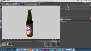
Open illustrator / open 'bottle.ai'
Or create a bottle shape / and a liquid shape
Open rulers / Move centre point to bottom of shape
Reduce art board size to fit
Save file as
-Illustrator 8
2. Cinema4d
Merge 'bottle.ai' / rename paths
Create 2 Lathe Nurbs / a
dd each shape
rename accordingly / tick flip normals
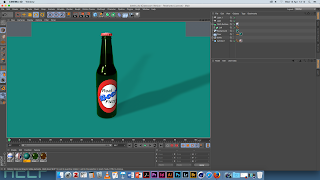
3. Create an environment
Create a Floor / Create a Background
Add a Compositing tag to floor
tick 'composite background'
Create a new material / change colour to white
(?)
Add material to floor & background
4. Create Materials
Browser / Presets / broadcast / Materials
Glass / Glass Stained (green)
Transparency / Refraction = 1,2
Turn absorption to white
Turn off bump channel
Copy Material / change colour to yellow
Add yellow to liquid lathe
Add green mat to bottle lathe
5. Create a Lable
Add a cylinder object / caps / untick caps
Adjust size to fit snugly around bottle
new material / Alp
ha channel / add beer mask.jpg
Invert mask / add to cylinder
material tag / turn off tile / projection / cylindrical
Right click on tag / Fit to object
Colour channel / add 'bearlable.jpg'
Reflectance Channel
Add ... / Reflecti
on (Legacy)
Layer Colour / Texture / Fresnel / dielectric / jadeTurn down Globals / add to cylinder
6. Bottle Top
Spline tool / Add a Star shape / 20 points
XZ axis / inner rad = 33 / outer rad = 37
Add a Circle shape / Rad = 33
Add a Circle shape / Rad = 29
Add a Circle shape / Rad = 17
Add a Circle shape / Rad = 0
Create a Loft Nurbs / add all above shapes
Move to top of bottle / move shapes to create a cap
Select the loft object / U subdiv = 41 / V subdiv = 2
Iso subdiv = 3 / Tick Organic form / Caps / turn off
Simulate / Cloth? Cloth Surface / Add loft to this
Cloth surface / subdues = 2 / Thickness = 1
7. Cap Material
New Material /
Reflectance Channel
Add ... / Reflection (Legacy)
Layer Colour / Texture / Fresnel / dielectric / PET
Colour / add 'cap.jpg' / Add material to cap
Material tag / projection = flat
Rt click / fit to object / say yes to sub-object
Left of viewport toolbar / select Texture Mode
Use rotate tool to rotate texture 90deg
Rt click on texture tag / fit to object / say yes
Left of viewport toolbar / select Model Mode
8. Add Lights
Omni Light / Coords XYZ /
-500, 1000, -500
Copy light / Coords XYZ / 500, 1000, -500
second light / intensity = 50%
Add an Area light / place on right of bottle
Coords XYZ / 500, 400, -400 / Rot H = 45deg
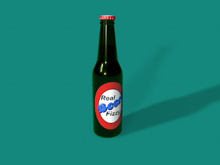
9. Render Out
Save file / Render out

Tuesday, 12 April 2016
My pattern design 2
eye
This pattern is designed in the previous manuscript to be improved, beginning only draw an eye, it blooms into a flower,, painting drawing eyes to a lot of tattoo work, with simple lines, and before the works, I like to add a new element on the manuscript, such as a dotted line, a circle, and the halo effect, so the work is more complete. In fact, during the most important idea is that I will try to add some new elements, feeling bad go modifications. I am in the process of every change, and will have a new idea, the reason for such a creation is complete will take some time to continue to improve and modify, and I in the creative process learned a lot.
Sunday, 10 April 2016
My logo design 2
Edwin
LEI TANG
LEI TANG is my Chinese name, each of these is very simple font has a lot of vertical lines, so I thought that I wanted to better myself these vertical lines together, so when the vertical composition longer pull, highlighting the advantages of vertical lines. Another point is that a lot of horizontal line, I just put all the horizontal lines are reduced, so that the font looks more slender. Finally found the time to look at the word put together feels too long, so that the two letters staggered, one last look, I'm in the middle of a new straight line, so that a more complete picture. Finally, there is the shaded part of the frame, so probably completed the logo design.
Subscribe to:
Comments (Atom)


